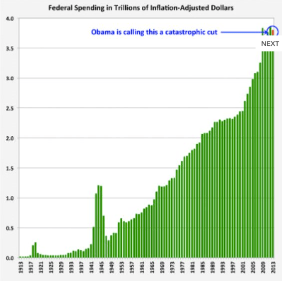
This incredible chart speaks volumes about the circus act that we call our government. The spikes towards the left are for WWI and WWII. The chart really speaks for itself, but I can’t resist the urge to highlight a few important points below.
The obvious takeaway is to notice just how tiny the spending cut is compared to all time record high inflation adjusted spending. (If I could nitpick a bit, it’s not just Obama calling these cuts catastrophic, but the Democrats, most Republicans, and every mainstream news source.) Compare that tiny sequester cut to the roughly 70% budget cut we had in 3 years after WWII. (Contrary to popular delusion, it was those dramatic spending cuts after the war coupled with being the world’s only producer with factories still standing that got us out of the depression, not the Wartime spending.)
Next, please note that this chart is of inflation adjusted federal spending. In other words, if per capita federal spending were to stay about the same we would expect a gentle rise in line with population growth. In 1913, the year the Federal Reserve Bank was created and the income tax was created, Federal Government spending was $715 million. Adjusted for inflation that equals $16.8 billion. There were 97 million Americans back then, meaning that in 1913 the Federal government spent $173 per person in today’s dollars.
Today, the Federal government spends $3.8 trillion annually (not counting what it owes to SS and Medicare trust fund) and the population is 314 million people. Today the Federal government spends $12,100 per person. That’s 70 times what we spent in 1913. If we include what the government should be putting into SS and Medicare each year to be actuarially sound, Federal spending would be around $9.5T or $30,000 per person or 175 times the spending of 1913.
Another important factor to notice is that the slope of the graph is increasing. In other words, the rate of the increase of inflation adjusted government spending is increasing.
However, there’s one more factor that could be playing a role in the astounding rise in government spending per person. That is, the CPI is not fully discounting the inflation rate. As I discussed in a post called Government Numbers, the government has an incentive to understate (i.e. hide) (i.e. lie about) inflation and has even changed the methodology for calculating inflation over the past few decades. If we used the same CPI deflator methodology we used in 1970, which I believe is more accurate, we get a per capita spending in 1913 of $668 or 18 times less than what we spend today. Better than 70 times, but still absurd.
In Summary:
1. All this talk of draconian cuts of the sequester is a load of crap.
2. The fact that we can’t cut even a tiny amount without inducing panic reflects just how fragile and over-leveraged our economy is.
3. The inflation adjusted federal spending since the inception of the Federal Reserve and income tax has been rising at an accelerating rate. And if we use GAAP (i.e. non-fraudulent) accounting the government spending is so mind bogglingly disgusting the mind rejects it.
4. One more bit of evidence that the official CPI is suspect at best.


![[Most Recent Quotes from www.kitco.com]](https://i0.wp.com/www.kitconet.com/charts/metals/gold/t24_au_xx_usoz_4.gif)
![[Most Recent Quotes from www.kitco.com]](https://i0.wp.com/www.kitconet.com/charts/metals/silver/t24_ag_xx_usoz_4.gif)
