
But these rose colored glasses, that I'm looking through, show only the beauty, cause they hide all the truth. -John Conlee
Do you ever get the feeling that something doesn’t quite add up with the economy? Does it seem odd that the recession officially ended in June of 2009 yet the Fed interest rate is still at 0-.25%. When Ben Bernanke assures us that there is no inflation, do you wonder if you’re the only sucker out there paying more for groceries, gas and clothes? Does it strike you as strange that in the strongest economy in the world, one in seven Americans are using food stamps?
Are the economists and pundits who paint a rosy picture of the economy simply drawing bad conclusions? Could be. Or, it could be that the data they are plugging into their computer models and economic theories is faulty. Could it be that the official government numbers are leading us astray?
At this point you may be asking yourself, “Why would the government fudge the numbers?” Then you might ask, “And why should I care?” The short answers are: 1) so the government doesn’t look as bad, and b) because it can have a dramatic impact on your investment strategy and financial well-being.
Economist John Williams has created a newsletter called Shadow Government Statistics, that, according to the website, “exposes and analyzes flaws in current U.S. government economic data and reporting, as well as in certain private-sector numbers, and provides an assessment of underlying economic and financial conditions, net of financial-market and political hype.” The shadowstats website is an important tool for anyone who wants to understand the true underlying fundamentals of our economy.
Below, is a discussion of the manipulation and misrepresentation of four important government numbers- the Consumer Price Index (CPI), unemployment rate, Gross Domestic Product (GDP), and the national debt and deficit accounting.
1. Consumer Price Index (CPI)
The CPI is the most commonly reported metric to measure inflation. It is a measure of the purchasing power of your dollar against a basket of consumer goods such as apples, gas, nails, clothing, computers, cars, healthcare, tuitions, rents, etc. According to the Bureau of Labor Statistics (BLS) numbers for Jan of 2011, the CPI rose 1.6% in the 12 months prior. Who do they think they’re kidding?
The government has several incentives for creating inflation, i.e. expanding the money supply by printing money and keeping interest rates low. First, Fed money printing allows the treasury to pay off the $14 trillion national debt with new money. Second, artificially low interest rates are the only thing preventing the housing market and banking system from going back into free-fall. Third, inflation is a stealthy way to bring in more tax revenue without raising rates because it increases capital gains and sales revenues on higher priced goods, and shifts people into higher tax brackets as their nominal salary increases.
At the same time, the government has incentives to hide the true levels of inflation. The government needs to borrow new money to finance our deficit, so we don’t want our creditors to realize the extent of our inflation because interest rates would need to rise above the real rate of inflation to attract new creditors. Higher interest rates would jack up the interest payment on the national debt and decimate the housing market. Another incentive to under-report inflation is because Social Security and Medicare payments are indexed to inflation. If the inflation numbers are artificially low, it lowers the expense for government (while squeezing the people who rely on these payments for retirement). Finally, if the people realized how badly they were being squeezed by inflation they would be up in arms.
In the late 1970s, out-of-control inflation was one of the main factors that stopped President Carter’s bid for re-election. The politicians learned their lesson, though, and have tweaked the ways the CPI is calculated since then to make inflation appear lower. There are three main ways the government can tweak the official CPI numbers. Those are hedonics, substitution, and weighting.
Hedonics involves adjusting the price of a good to account for the increase in the quality of that good. For example, if an entry-level computer costs the same as an entry-level computer of a few years ago, the government will calculate this as a price decrease since todays computer has twice the speed and memory. They argue that you’re getting more bang for your buck, but in reality, you still have to pay for a new computer. Those improvements came entirely from technology advances and productivity gains, which should be making products less expensive if the dollar was maintaining its value.
Substitution claims that if the price of a particular item rises, customers will substitute a similar, competing item, i.e. hamburger for steak. That’s BS. A steak is a steak and hamburger, while still quite tasty, is just hamburger. The BLS will then increase the weight of items going down in price because consumers will choose more of them so they are a bigger part of the basket. Which brings us to the next adjustment…
 Weighting – The BLS assigns weights to different goods and services based on their relative proportion of the overall economy. The chart to the right shows the weighting of various sectors of the economy. As Chris Martenson points out in an excellent article on fuzzy inflation numbers,there appears to be some creative license on how the weights of certain goods are assigned. Martenson uses the example of healthcare, which is weighted at 7% in the CPI calculation while making up 18% of the GDP. Apparently, corporate and government benefits are not counted in the weighting. (Martenson also notes that the BLS uses an “indirect” method for determining health insurance premiums which shows premiums rising 52% in the past decade, while actual insurance premiums have gone up 131%.)
Another important thing to note is that “housing” makes up 42% of the CPI weighting. Since the housing bubble burst, housing has had a negative affect on CPI hiding the inflation in other parts of the CPI. You might ask why housing didn’t significantly raise the CPI when the housing boom was causing house prices to rise 15% a year. That’s because the BLS uses “owner equivalent rents”, or the price a homeowner could rent her house for, instead of the actual mortgage payment or house price.
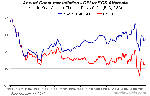
The chart below from shadowstats re-creates the CPI number as it was calculated in 1980 without hedonics and substitution. The chart shows that the real CPI number is closer to 9% than the 2.1% recently reported by the BLS.
In 1980, Fed Chairman, Paul Volker, had to raise interest rates to 20% to fight 15% inflation. Today with inflation at 9% using the same metrics, Bernanke has pledged to keep rates at 0%. Does anyone see a problem looming here?
So what does this mean for investors? Well if the true inflation rate is 9%, then the real interest rate on a 5 year treasury bill yielding 2.2% is negative 6.8%. That is, a 5 year t-bill is loosing 6.8% of purchasing power every year. (That would explain why the only buyers of government debt right now are the Fed, and to a lesser extent, foreign central banks.) It is clear that interest rates will need to rise moving forward to keep inflation from getting out of hand. That means our Federal interest payments will increase, mortgage rates will increase further depressing the housing market and sending banks back into insolvency, and credit will shrink, depressing the economy. Since the Federal Reserve is looking at the phony CPI inflation rate, they will continue to be behind the curve keeping real interest rates negative as far as the eye can see. Negative real interest rates are one of the main reasons gold, silver and other commodities continue to rise.
The other reason we can count on the Fed to keep rates lower than they should be, is that they focus on the “core” inflation rate, which excludes the price of food and energy. Their justification is that food and energy prices are volatile and not indicative of “underlying inflationary trends.” This is another line of BS. It may be true for month to month numbers, but over the course of a year or more those price rises are simply due to constant money printing. The Fed can’t claim bad weather for the past decade. Food and energy prices could be normalized using a moving average number if volatility was the real concern. Everyone needs food, and rising energy costs affect the cost of everything. To dismiss them is disingenuous at best.
One final reason why the CPI by itself is a bad metric to guide Fed policy and investment decisions is that it is backward looking. There is a lag time between when the Fed prints money and when that inflation shows up in rising prices. Just because the CPI has been fairly tame so far, doesn’t mean it will continue to be. In fact, from just November of 2010 to February of 2011, the annualized CPI number rose from 1.1% to 2.11%.
2. Unemployment Rate
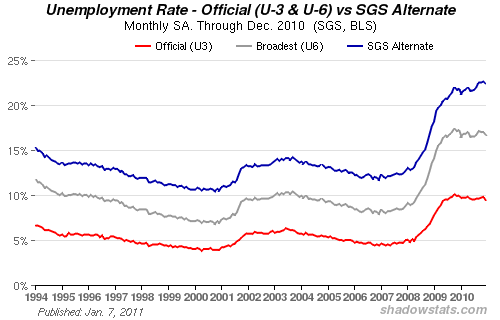
The official report we hear in the media is that unemployment is rate is bumping along around 9%. This reported rate, labeled U-3, includes unemployed people who are considered part of the civilian labor force but does not account for people working part-time who would prefer full-time work and discouraged workers who have given up looking because they feel they have no prospects.
The broadest (and rarely reported) official unemployment number by the government is the U-6 number which includes those part-time workers and discouraged workers who have looked for a job in the past 12 months. The shadow government stats number on the chart below, includes long-term discouraged workers who as John Williams says, “were defined out of official existence in 1994.”
So which is the right number? Probably none on their own, but instead it’s important to look at all of these metrics together along with other indicators. The important takeaways are these:
1. The 9% number you hear on the news is only one piece of the puzzle. The actual percentage of workers who are negatively affected by the job market is actually much larger. This means more people who have to cut back on their spending, more people dipping into their savings, more people who’s skills are atrophying, and more people receiving funds from the government. None of these trends are good for the economy.
.2 It is possible for the unemployment rate to go down, as it has been for the past few months, without increasing jobs. This is because as people give up on looking for a job, they are no longer part of the official labor force so the denominator in the equation shrinks.
3. Gross Domestic Product (GDP)
Gross Domestic Product is the most commonly used measure of economic production in the overall economy in a given time period. The GDP is used to gauge the growth of the economy and is seen by many as an indicator of the country’s standard of living. The GDP is useful as a general measure of the size of the economy and also as a reference for other financial indicators such as the national debt. For example, a $14 trillion national debt doesn’t mean much on its own until you compare it to the overall size of the economy, a.k.a. debt to GDP ratio. (And when you do that for the US, you’ll find a debt to GDP ratio nearing 100% which is downright scary.)
The problem many people have is an over-reliance on the overall GDP number as an economic indicator. The GDP can be calculated in a few ways, but the most common is by tallying up the expenditures on personal Consumption, private Investment, Government spending (federal, state and local), and net exports. It can be expressed be the formula:
GDP = C + Inv + G + (eX – iM)
As you may have deduced from the above formula, not all GDP is created equal.
A high level of Consumption simply means that consumers are living well that period. I would consider this a neutral component, although rising consumption could indicate an increase in earnings, which is good, or a decrease in savings and higher borrowing which just means less consumption in the future. With high personal debt levels, low savings and high unemployment, the future doesn’t look strong for the spending component of GDP.
A high Investment component means that companies are investing in capital equipment and R&D to increase productivity which helps grow the GDP in the future. This is a very positive and sustainable means of GDP growth.
A high Government component as a percentage of GDP is generally a drag on the economy. Every dollar the government adds to the GDP, must first be taken from companies and consumers in the form of taxes and inflation, or borrowed. Borrowing from other countries simply steals from the future and at a certain level (which we are fast approaching) even hurts present GDP. Some basic levels of government spending can be good for sustained GDP growth by maintaining the rule of law, defending the country and providing some crucial infrastructure investment. Unfortunately, we are waaayyyy beyond that level and addition government spending only detracts from sustainable economic growth.
A high net exports component means our country is increasing its wealth by producing goods and selling them to other countries. Unfortunately, our net exports have been negative for decades. We were able to do this because we had a high level of wealth built up in this country that we could use to buy foreign goods, and because we could print the reserve currency of the world and trade dollars for goods.
The bad news is, the only component of our GDP that seems to be growing right now is the Government expenditures. And in fact, government expenditures are underrepresented by the GDP numbers because transfer payments such as Social Security, Medicare, bank bailouts and homebuyer tax credits are counted in the consumer spending category when the recipients of these transfer payments buy goods. It should also be noted that government expenditures are growing through borrowing from other countries and printing by the Fed. This is not good GDP growth.
When economists look at GDP growth, they adjust the numbers for inflation to get a better feel for the real growth of wealth. As discussed above, the inflation numbers as calculated by the CPI are dubious at best. Below is a chart of GDP annual percentage change adjusted for inflation using the government numbers and Shadowstats numbers.
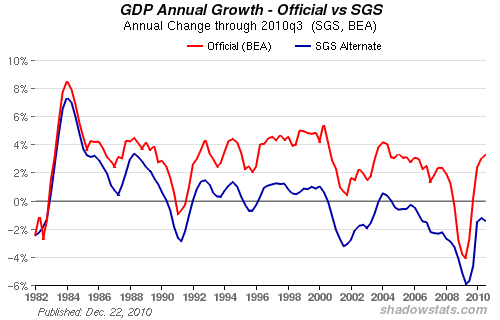 If you believe the government numbers, we came out of the recession in 2009. If you instead use the Shadowstats numbers, you would conclude that the recession is ongoing.
4. Government Debt and Deficit Accounting
Most people who are paying attention can tell you that the national debt is around $14 trillion and our deficit this year is around $1.6 trillion. That sounds pretty bad.
But in the world of government numbers, the numbers you hear are only part of the story. It turns out the reported budget deficit (or surplus) is only part of the amount that gets added to the national debt each year. It doesn’t include off budget items like emergency war appropriations and earmarks. The chart below compares the reported deficit numbers with the actual increase in the debt.
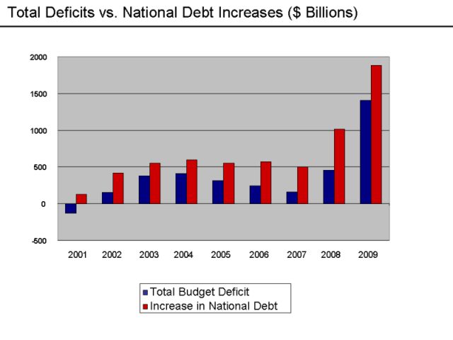 But there’s more. The government reports its debt and deficits on a cash accounting basis. That is, the yearly deficit is simply the amount of money it spends minus the amount it takes in for a given year. It does not include the future liabilities the government has promised to pay for entitlements or the federal guarantee of Fannie Mae and Freddie Mac. If a corporation tried to run its books this way it would get dragged over the coals. Public companies report their books based on generally accepted accounting principles (GAAP) which account for the present value of future liabilities and assets. Though not widely reported, the US Treasury does offer GAAP based accounting statements for each year which are shown below for 2010.
Federal Deficit 2010 ($Trillions)
Formal Cash Based Accounting: $1.294
GAAP (excluding SS and Medicare): $2.080
GAAP (including entitlements): $5.300 (1)
(1) This is John Williams estimate for 2010 and is similar to the official 2009 number. The official reported 2010 number of -$7T includes a one time $12.3T write down of the net present value of medicare liabilities based on favorable assumptions of the new healthcare bill.
Federal Debt 2010 ($Trillions)
Cash Based Gross Federal Debt: $13.6
GAAP Total Federal Obligations: $76.3 (2)
(2) Again, this doesn’t include the $12.3T write down. The official government number is $64T. I’ve also seen numbers over $100T for the total federal obligations from other sources.
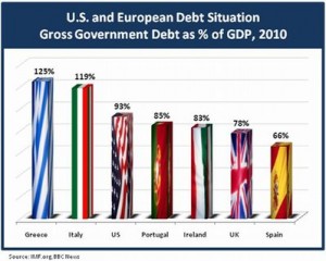
Countries get themselves into big trouble when their debt to GDP ratio reaches 90%. Bond yields have skyrocketed in countries like Italy, Greece, Ireland and Portugal with high debt to GDP ratios. The only reason our rates haven’t risen as well is because we can print the reserve currency of the world.
Our debt to GDP is quickly closing in on 100%. But if you look at our total Federal obligations, our real debt to GDP ratio is over 500% of GDP.
Summary
If we take the government’s numbers at face value it’s easy to see why some economists and market analysts are sanguine about the economy. It looks like inflation is not too bad, unemployment is high but gradually improving, low interest rates should continue to boost the stock market, the GDP is expected to rise 4% or so this year, and the debt may be high, but interest payments are low due to low rates.
But if you look behind the official numbers and see how they are misrepresented, manipulated and misused, the picture is rather grim. So how do these numbers tie together and what does it all mean?
If we understand the inflation is around 10% and rising, and that real unemployment rates are somewhere around 20%, we realize that consumers will have less discretionary purchasing power. That means the “C” part or the GDP equation is headed down in real terms.
If we realize that manufacturers are at roughly 75% capacity utilization (one of the reasons Keynesians think there can be no inflation) and that companies’ margins are being squeezed by higher costs, more regulation and poorer customers, then we can bet that the “I” part of GDP won’t be increasing any time soon despite low interest rates and government stimulus for investment.
Net exports continue to subtract about 5% from GDP each year.
That leaves government to continue to fill in the gap if we want to grow GDP. But government can only spend what it taxes, borrows or prints. Higher taxes would put downward pressure on an already fragile recovery and wouldn’t bring in much more revenue. Borrowing is becoming harder as our lenders realize that real interest rates are negative and that our debt is almost 100% of a GDP bubble. That leaves printing as the only means of growing government spending and thus nominal GDP.
If the Fed continues to print by buying up Treasuries, the GDP may rise nominally, by it would fall in inflation adjusted terms and could even precipitate a collapse of the dollar. If they stop printing, the government would be forced to drastically cut back on its spending which would crash the economy. Either way the economic future doesn’t look so pretty without the rose colored government numbers to hide the ugly truth.

![[Most Recent Quotes from www.kitco.com]](https://i0.wp.com/www.kitconet.com/charts/metals/gold/t24_au_xx_usoz_4.gif)
![[Most Recent Quotes from www.kitco.com]](https://i0.wp.com/www.kitconet.com/charts/metals/silver/t24_ag_xx_usoz_4.gif)

Pingback: Silver: ‘Toppy’ or Just Warming Up? | Gold, Silver & Platinum Coins & Bullion
Pingback: Silver: ‘Toppy’ or Just Warming Up? | The Financial Feed
Pingback: An Investment for the Average Joe that Yields 16%, After Tax, Guaranteed, with Zero Risk!!! | Liberty Insight
Pingback: Happy Thanksgiving! Make Next Year’s Feast 10% More Bountiful. | Liberty Insight
Pingback: Liberty Newswire – 2/10/2012 | Liberty Insight
Pingback: Understanding Gold Pricing | Liberty Insight
Pingback: The Real Fiscal Cliff | Liberty Insight
Pingback: Chart of the Week: Federal Spending and the Sequester | Liberty Insight